#1
#1Hi growlings!
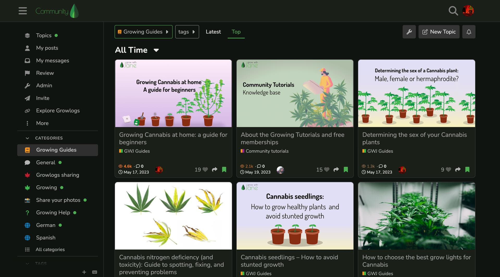
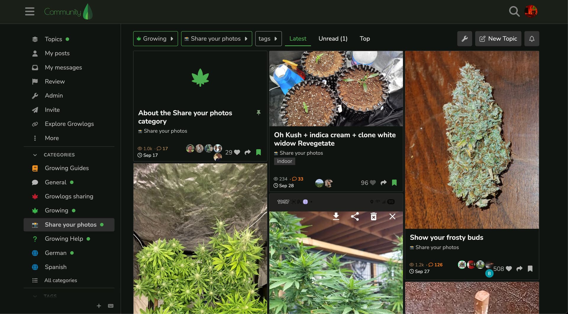
We’re testing some changes in the user experience for the Community.
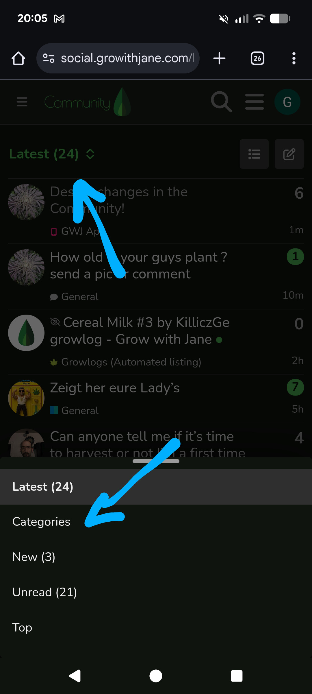
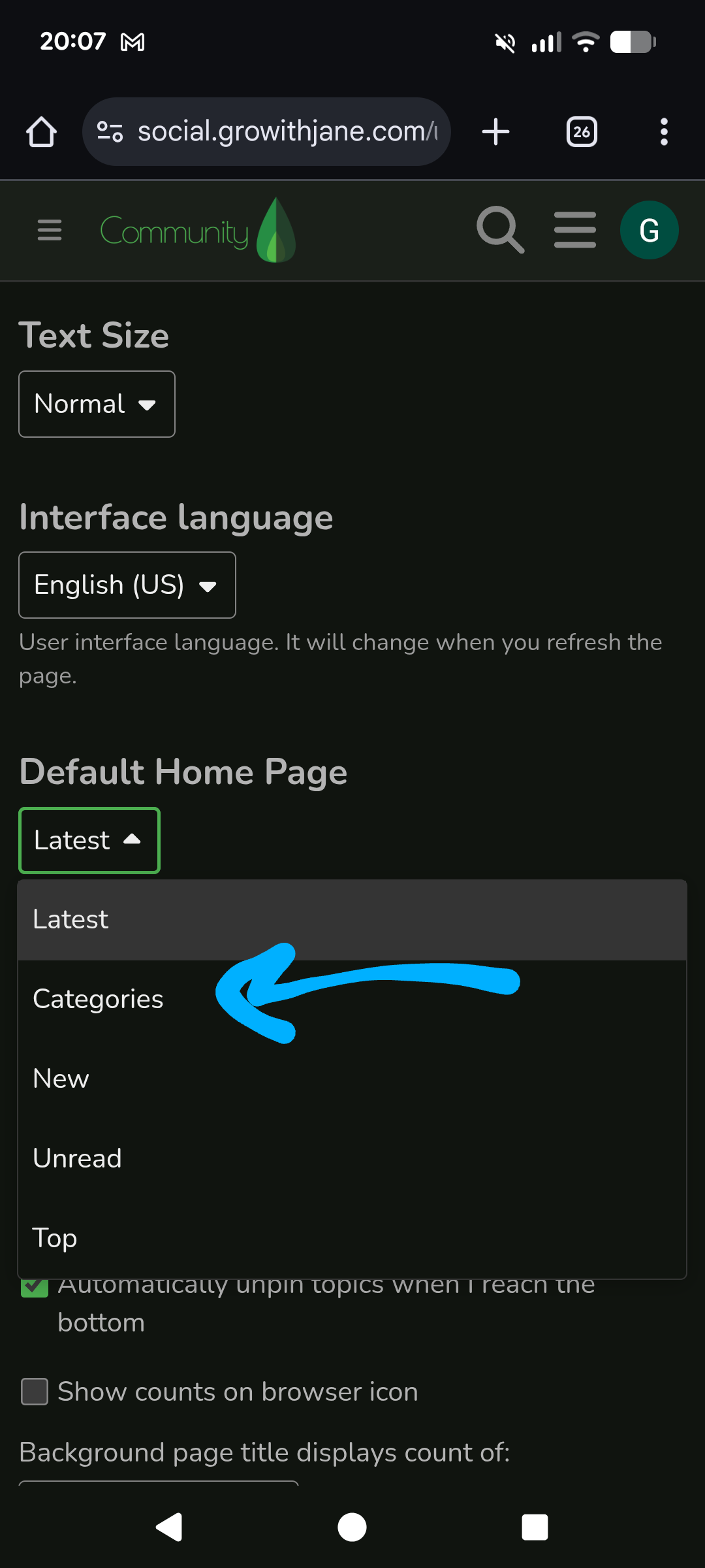
In mobile, the default navigation now is Latest Topics instead of the Mix of Categories / Topics we use to have. Categories are accesible through the “Categories >” dropdown or at the menu at top right.
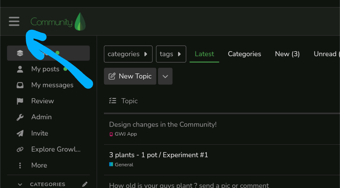
In desktop this is also true, but you get the categories on a sidebar.
Other than this, we’ve updated colors, translations, typography and some other details.
We’re trying to make the Community more accesible and friendly - the design we were using was developed many years ago already. We’re going to continue adding and testing new features.
What do you think? Let us know how we can make it better


 photos say a thounds words but videos say more hahahaha