 #7
#7I personally think that’s the better looking version. It also feels more intuitive. I do however understand the desire to give the app a face lift.
25 respuestas · 257 visitas
#7I personally think that’s the better looking version. It also feels more intuitive. I do however understand the desire to give the app a face lift.
 #8
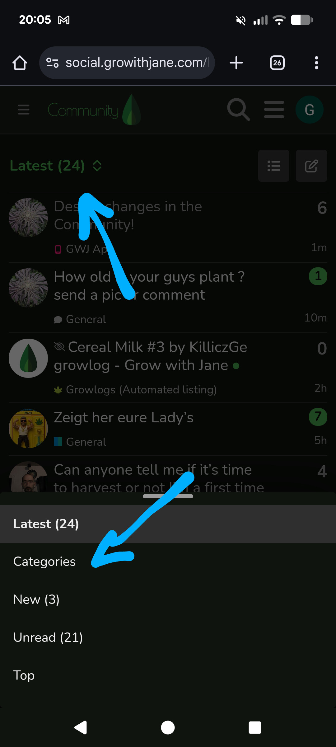
#8Perfect! We’ll keep that view as the “Categories” view for now and we’ll decide which one will default as the home view. You can switch between views in this selector:
However, you can actually go into your account preferences (Account > Preferences > Interface) and setup your preferred homepage:
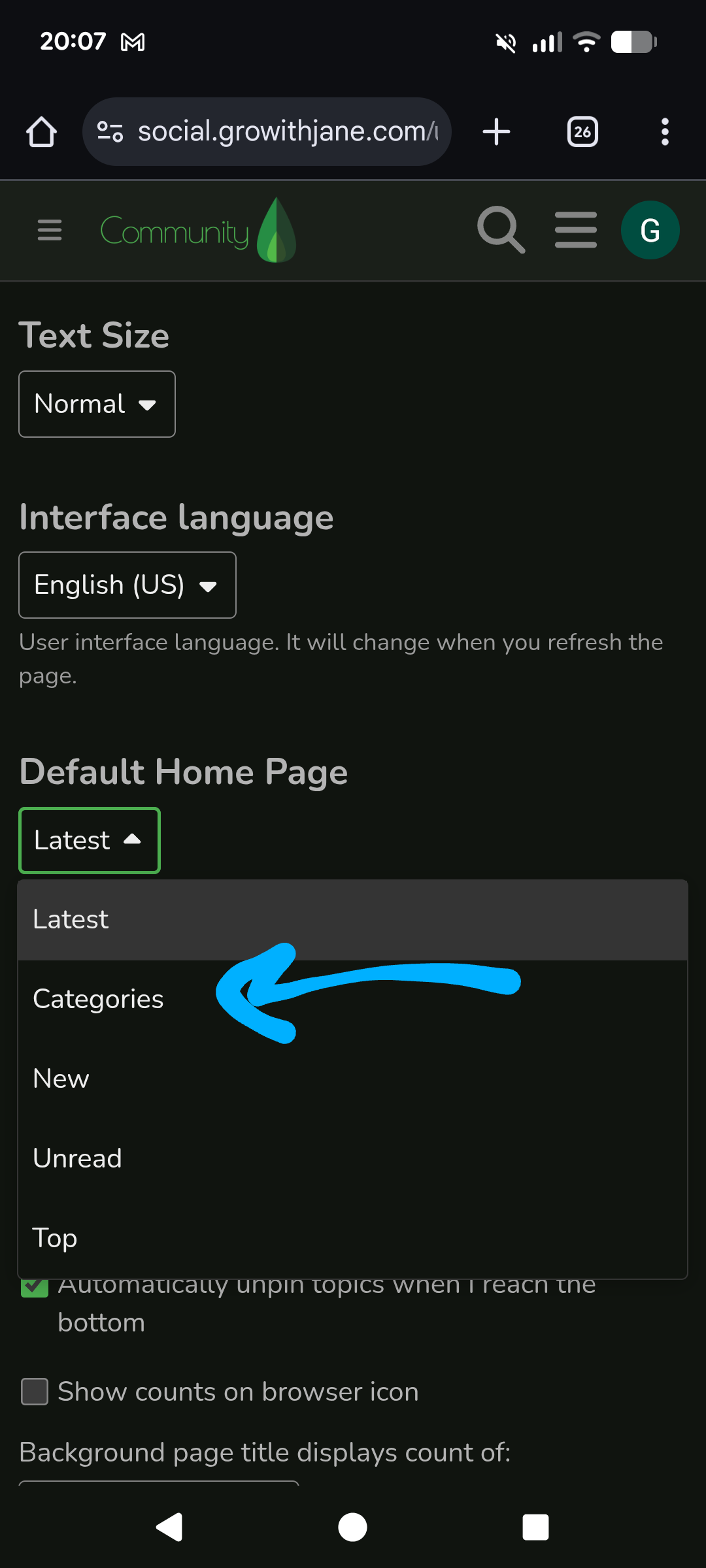
To get there:

This should leave it exactly as it was
#9I’ll talk with the tech team about adding video to the Community. I think it’s doable, we need to check size and format limitations.
#10Thank you for showing me how to do that. I never knew that was an option. BTW I want to thank you for jumping on this topic as fast as you have.
By chance do you know why the view of the homepage was doing weird views over the last year?
As for the videos (not that you need my input) I understand server size plays a role in many decisions. I believe even a 30s duration would cover most situations.
I’ve also noticed an issue tagging multiple people at once. Sometimes it adds the first tag as the second even when that wasn’t what was typed. I’ve also had it delete more than one while the screen hops around. I’ll try and screen record it next time, I’ll post it privately to YT and put the link in this thread. It’s not an every time issue either so it may take a few days to get it on video.
#11By chance do you know why the view of the homepage was doing weird views over the last year?
I think I know what you are referring to. We saw an issue happening on some phones where the Community website wouldn’t properly recognize if it was rendering on a desktop device or on a phone and was displaying some components incorrectly. This issue was also solved today as we deployed all the new changes.
As for the videos (not that you need my input) I understand server size plays a role in many decisions. I believe even a 30s duration would cover most situations.
We absolutely need your input, yours and everyone else. Also, I agree.
I’ve also noticed an issue tagging multiple people at once.
Huh… I’ll check as well. Thanks for the report!!
#12Dude you are a superstar
 #13
#13This would be awesome.
 #14
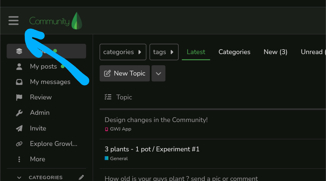
#14I only use the desktop version and my shortcut is set to the “latest” page as my home/start page . . . can I get rid of the sidebar? I can find different categories if needed, the sidebar just clutters up the home page with a persistent and unneeded list on the side.
#15Absolutely. You can close the sidebar by hitting the menu icon on the left, above the sidebar
 #16
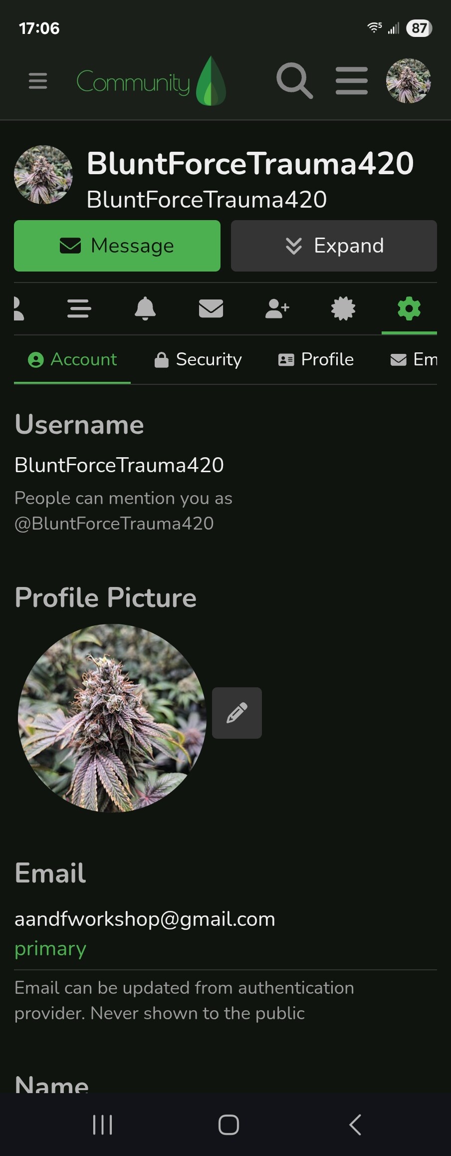
#16I’m confused as to how I get to the homepage edit
 #17
#17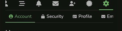
Scroll this little menu to the left until you see “Interface”
#18Thank you! I got it set up
#19We’ve added 2 new category views:
Growing guides (ex “Knowledge Base”) is now looking like a grid:
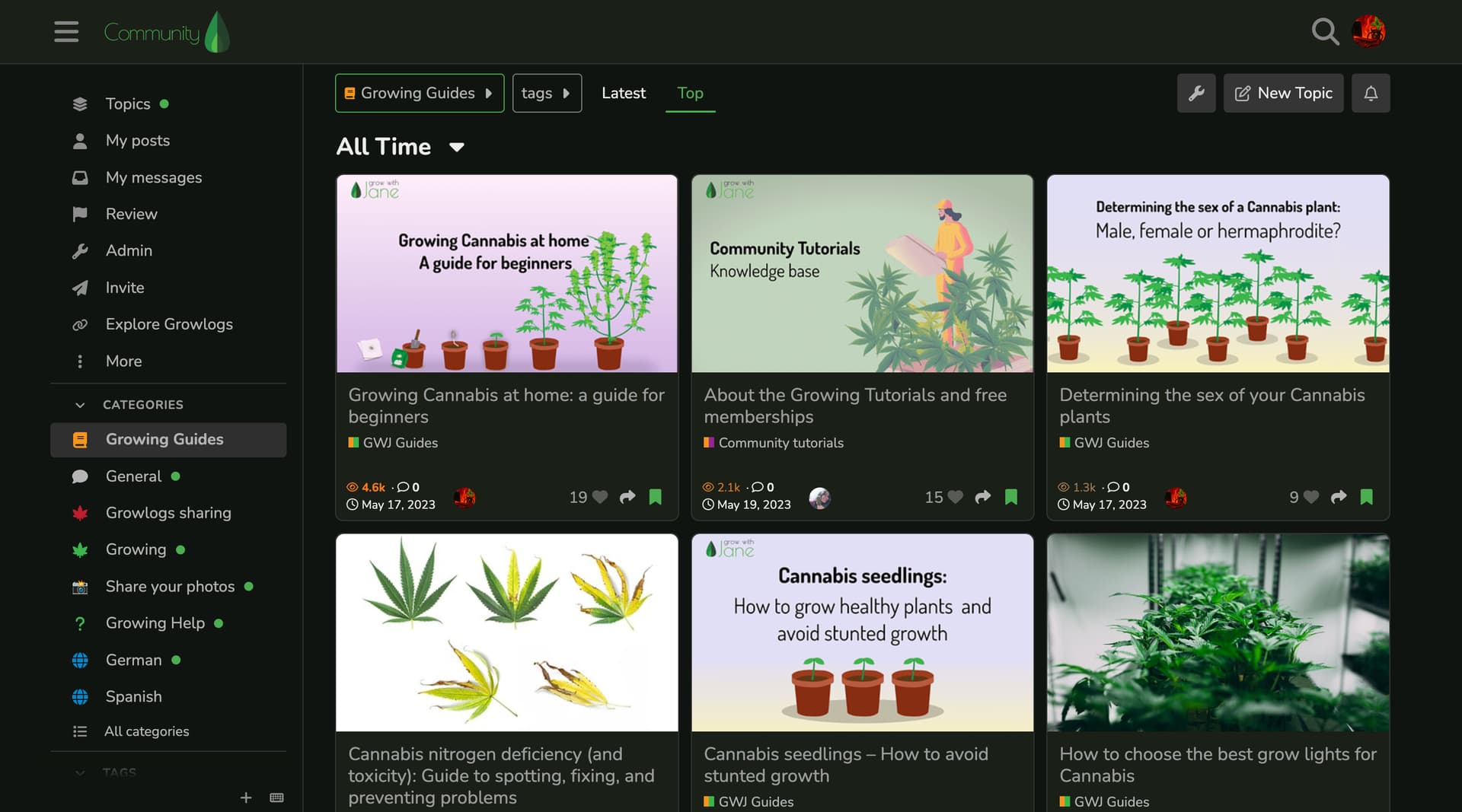
While Share your photos is now showing as a proper photo gallery:
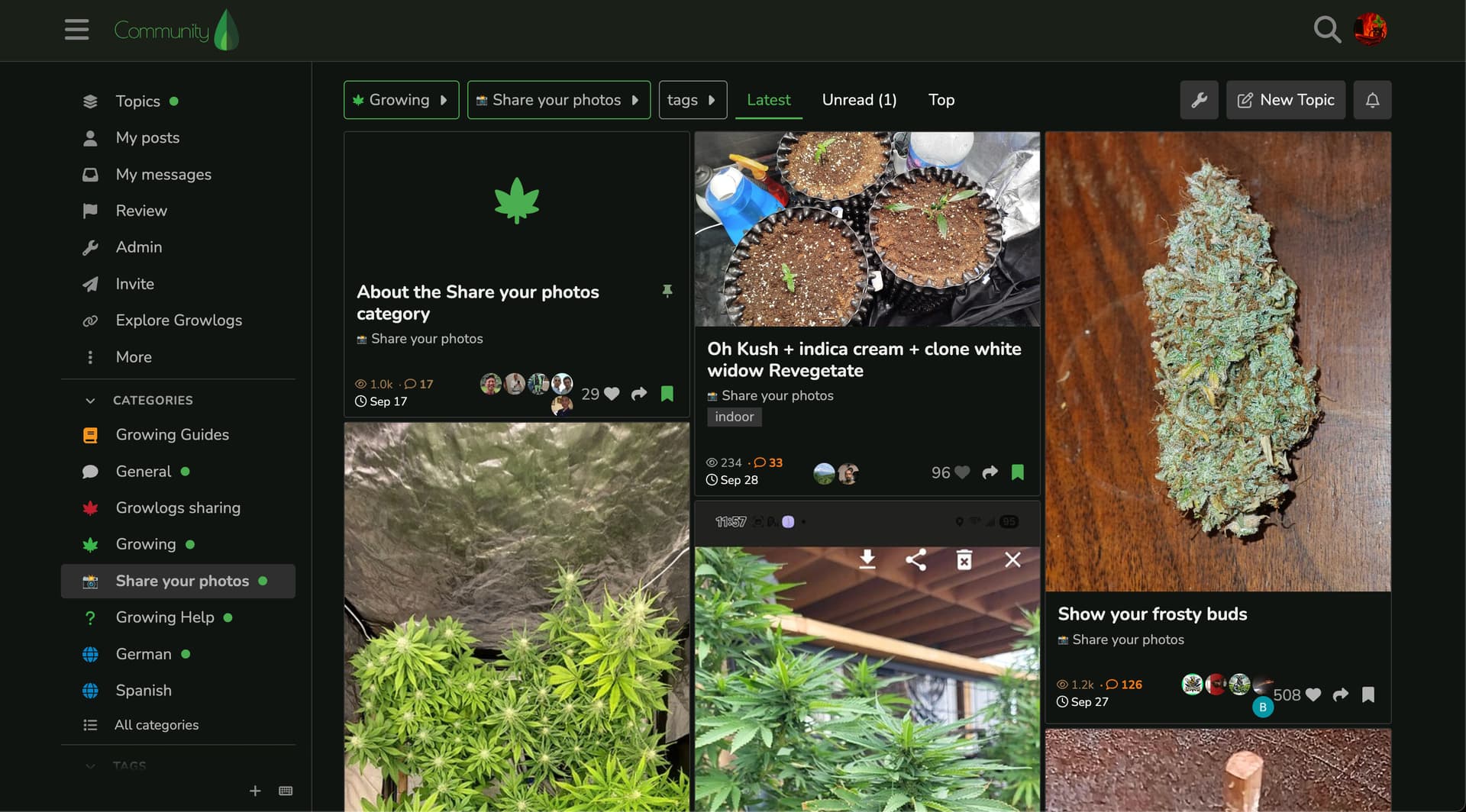
What do you think?
#20We’ve momentarily deactivated the category layouts as we work out some issues. Sorry if you experienced some community downtime!
 #21
#21I like the new layout with the categories in the sidebar, much easier to navigate. The previous layout was inconsistent for me on my older iPad; sometimes it listed every post vertically and I couldn’t change categories easily, other times it would act right.
#22On the app after you add a photo it’s really hard to type under it. Is there a way to add a margin under the pic to make that easier?
 #23
#23Thank you for this suggestion! I will send it to the team!
#24Feel free to submit app suggestions in our GWJ App > Feedback channel! Makes it easier for other users to chime in and support or add extra details 
 #25
#25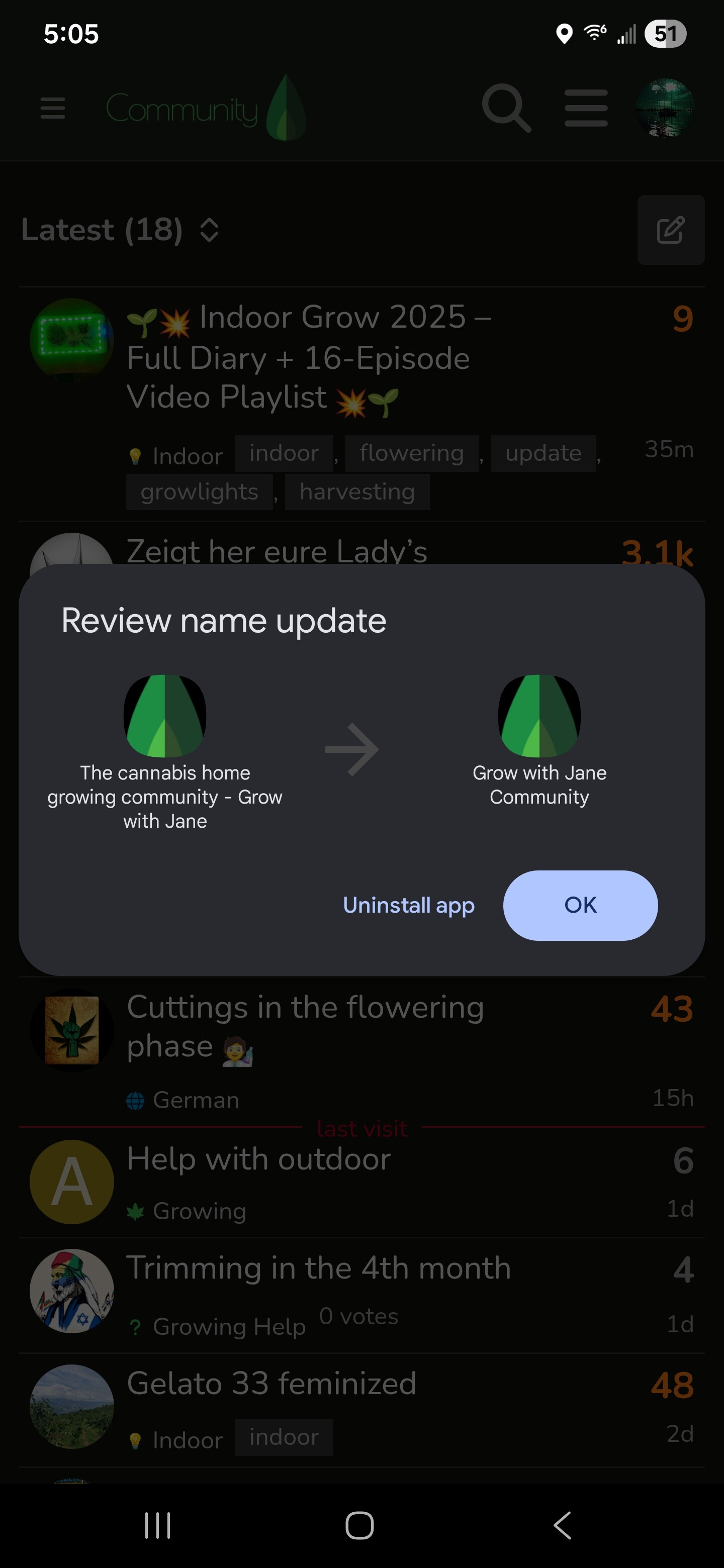
this pops up every so often. How do I get it to stop? I hit ok and goes away. Then later in the day or so I’ll open app up and it’ll pop up again.
#26Thanks for the report Ozzie. If it keeps popping up, uninstalling and installing it again might do the trick